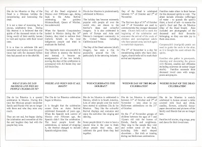
I wasn't well today, so didnt go to CURA100. Instead, I typed up text for the adult and kids wall plaque.
The question for each bit of info is in the centre row: the adult info is in top row and kids info in bottom row.
This came from Will's idea of having two different levels of text - higher for adults and lower for kids. This would allow for more detailed informative text for an adult audience and an easier to understand piece of text for younger children which didnt focus on the theme of death. We wanted to be sensitive to a young child's level of understanding and didnt want it to be a frightening experience for them or have to deal with angry/upset parents.
When we visited the museum last week, Will took photos of wall plaque which echoed his idea. We propose to photoshop the text into the museum photos to give a visual realistic example.
Danby darling, if you're happy with the text, you can copy and paste it into new doc, make it look a bit more interesting if you like - with pics, change of font etc and photoshop it into museum pic, as your'e far more knowledgeable in that department than I, cheers m'dear ;)
oh, by the way, theres absolutely no reason why some text is grey, just my laptop acting odd
ReplyDelete